

Table Of Contents
- The Shift From Perfect To Personal
- Why Imperfect Images Feel More Human
- Common Types Of Lo-Fi Visual Treatment
- Where Lo-Fi Design Works Best
- A Simple Workflow For Building The Look
- Mistakes That Make Lo-Fi Design Look Sloppy
- Keeping Rough Visuals Clear And Accessible
- Common Questions About Lo-Fi Design
- Final Takeaway
Perfectly polished visuals can be useful, but they are easy to overlook when every post, ad, and presentation uses the same spotless finish. A little grain, blur, fading, or uneven framing can interrupt that sameness and make an image feel more personal. A low quality image maker can be a practical starting point when you want to explore that intentionally rougher visual direction without damaging the purpose of the design.
Lo-fi visual design is not an excuse for careless work. It is a deliberate use of texture, limitation, and irregularity to create mood. The most effective examples still make the subject clear, guide the eye, and give viewers the information they need.
The Shift From Perfect To Personal
Digital design has spent years rewarding polish: smooth gradients, exact grids, sharp imagery, and carefully controlled branding. Those tools remain valuable, yet a polished surface alone does not always communicate a point of view. An uneven crop or a scanned-paper texture can signal that someone made a specific choice rather than accepting a default template.
That interest is visible in lo-fi and retro-tech styles, which Canva reported were gaining momentum in its 2026 design-trend research. The appeal is not simply nostalgia. It is the opportunity to give a digital image evidence of touch, chance, memory, or experimentation.
Why Imperfect Images Feel More Human
Viewers encounter visual flaws in everyday life. Old family photographs fade, printed flyers collect texture, phone cameras catch motion blur, and handwritten notes vary from line to line. When design borrows those cues, it can feel familiar rather than manufactured.
What Imperfection Can Add
- Recognition: Familiar visual flaws can recall personal photos, zines, records, and printed materials.
- Contrast: A rougher image may stand apart from highly polished content nearby.
- Story: Grain, fading, and blur can suggest movement, age, place, or memory.
- Personality: Hand-drawn marks and irregular spacing can make a layout feel less generic.
- Warmth: Softer surfaces can support an intimate, relaxed, or reflective tone.
The important distinction is intention. A visual should not be degraded simply because lo-fi is fashionable. Each imperfect detail needs to support the subject, feeling, or story.
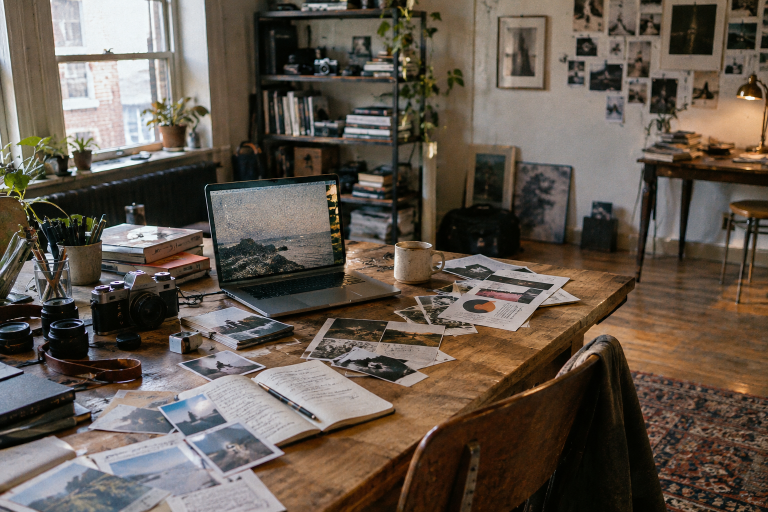
Common Types Of Lo-Fi Visual Treatment
Lo-fi design can take many forms, and each treatment changes the mood in a different way. Start with one or two choices that fit the project instead of layering every possible effect.
- Film grain: Adds a tactile surface to an otherwise clean photograph.
- Soft focus: Reduces clinical sharpness and can create a dreamy or distant feeling.
- Color fading: Can suggest sunlight, age, memory, or repeated handling.
- Light leaks: Introduce a sense of accidental capture or movement.
- Uneven cropping: Creates energy and makes a layout feel less formal.
- Paper texture: Gives digital artwork a physical-looking surface.
- Low-resolution details: Can reference early web graphics, old cameras, or photocopied print.
- Handwritten marks: Bring a direct, individual voice to captions and collage work.
Where Lo-Fi Design Works Best
This style is strongest when its mood matches the project. It can suit music artwork, independent fashion campaigns, editorial graphics, personal portfolios, documentary promotions, horror projects, and social posts built around memory or storytelling. It is usually less suitable when a project depends on strict precision or formal authority.
Consider a neighborhood music event poster: one faded photo of the venue, two ink-like colors, and a small handwritten note can make the event feel local and specific. The date, location, ticket details, and call to action should remain clean and easy to find. The texture carries the personality, while the structure carries the message.
A Simple Workflow For Building The Look
- Define the mood. Choose a few words, such as nostalgic, eerie, playful, warm, or homemade.
- Start with a strong image. Pick a photo with a recognizable subject and useful composition.
- Choose one main distortion. Begin with grain, fading, blur, or texture rather than all four.
- Limit the palette. A small color range helps the image feel cohesive.
- Add one human detail. Try a scribble, rough border, note, or simple collage shape.
- Check the message. Confirm that the subject and purpose remain immediately understandable.
- Test real sizes. Review the work on a phone, a desktop screen, and a small thumbnail.
- Remove one effect. If the result feels busy, simplify before adding anything else.
Mistakes That Make Lo-Fi Design Look Sloppy
Controlled imperfection still needs hierarchy. Common problems include using too many filters, burying text in texture, adding noise without a clear mood, copying a trend that does not fit the subject, and reducing contrast until essential details disappear. Keep the message clean and let the surface carry the roughness. Viewers should sense the mood before they notice the technique.
Keeping Rough Visuals Clear And Accessible
Expressive design should not block communication. Keep essential text away from the busiest parts of an image, use solid panels behind small type when necessary, and do not depend on color alone to communicate key information. Meaningful images also need descriptive alternative text. The Web Content Accessibility Guidelines provide practical criteria for contrast, text alternatives, and content that people can perceive and use.
Common Questions About Lo-Fi Design
Is Lo-Fi Design The Same As Low-Quality Design?
No. Lo-fi design uses selected imperfections on purpose. Low-quality design usually contains uncontrolled problems, such as unreadable text, weak spacing, or images that no longer communicate their subject.
Does It Work For Every Brand?
No. It works best when warmth, nostalgia, experimentation, or an informal point of view supports the brand. A clinical service, legal document, or technical instruction may need a cleaner approach.
How Many Effects Should An Image Use?
There is no fixed number, but one strong treatment often has more impact than several competing ones. Let the audience, platform, and message determine the level of imperfection.
Can A Clean Image Still Feel Human?
Absolutely. Framing, lighting, typography, subject choice, and an honest story can all create human character. Imperfection is a creative option, not a requirement.
Final Takeaway
Imperfect imagery feels human when it looks chosen rather than careless. Use grain, blur, fading, texture, and uneven details to strengthen a story, not to hide a weak one. The best lo-fi design brings a sense of place, touch, and authorship to polished digital spaces while keeping the message clear.