Money is tight these days, and cash certainly doesn't grow on trees. If you feel like you don't have enough money to meet your basic needs, it is very easy to feel helpless and alone with your beaten down budget or small savings stash. Things could get even worse with tariffs, even if things improve economically long term.
According to recent data, around 80% of Americans say that they are struggling financially, so you can rest assured that you are in good company. Much of the United States and global population struggles with personal finances in one way or another, especially with public health crises and inflation causing additional strain. Financial struggles are even gripping the upper middle class in the U.S. and much of the world due to severe inflation and economic volatility. The global economy and the personal finances of billions of people is looking rather grim right now.
One of the major reasons why the majority of people are in such a poor financial state is lack of education on money management and a limited understanding of budgeting. If you don't know your numbers and can't put a plug in your spending, you are setting yourself up for financial failure.
Unfortunately basic financial education just isn't something they teach at a lot of schools or even colleges. That is starting to change out of necessity, but most students even with above average intelligence have very little knowledge of money or budgeting.
Learning how to create a monthly budget won't solve all of your financial stress, but it will certainly make it easier for you to feel secure and afford basic living expenses. And every little bit of extra budget-friendly financial security helps these days in a time of economic turbulence coupled with rampant inflation.
Read on to learn how you can set this frugal budget and ensure that it works for your specific financial needs. Take notes if you need and make sure to implement these finance suggestions.
6 Top Tips To Create Monthly Budgets That Save More Money
1. Use a Budgeting App To Stay On Track
For those who have trouble keeping track of a lot of papers, budgeting apps can work wonders. You can conveniently enter your information into budgeting mobile applications including your necessary expenses, income, changes to your finances, and more. Pretty much all of these apps for budgets connect with your bank and do the math for you by figuring how much you need to allocate where.
PocketGuard is one of the best free apps that connects your credit, checking, and savings accounts to better your budget planning. It detects your recurring bills and compares them to your income before showing you how much you have remaining for other expenses. From there, you can master your monthly budget for groceries and household needs that exist outside your recurring bills.
One of the greatest things about Pocket Guard is that while it categorizes your expenses automatically, you can also create custom categories for the best budgetary plans. This lets you include the things that are important to you within your monthly budget to find areas of improvement and savings. You also never want to forget about any bills so you can avoid late fees or surprise final notices. It also reminds you to consider tax fees and relief options.
2. Write All Expenses And Bills Down
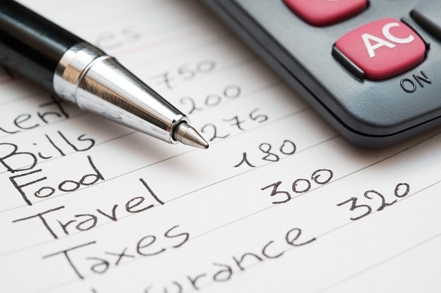
In addition to having a budgeting app, you will want to write everything about your budget down on paper. You can place this above your desk at home or on the wall beside your calendar. When you see it, you will remember how much you have to spend and where your money should be going to.
Prefer a more hybrid setup? Having a virtual executive assistant to help you with financial management is also an option. They can maintain detailed expense trackers for you, ensuring you always have an updated overview of your budget. This human element might just be the thing you need if applications aren't working for you.
Writing things down also has been proven to improve memory and fiscal fitness. It forces your brain to process things in a more detailed way. Writing the details of your budget will help you to keep it in mind throughout the remainder of the month, even when you are at the store with a dead cell phone battery and no physical list to look at.
3. Consider The Expense Essentials First
Before setting a budget, you need to consider your recurring payments like rent, utilities, insurance payments, student loans, and routine medical bills. You can't stop these bills from coming and missing them will ding your credit score and accrue interest.
The next budgetary thing to think about are essentials like groceries and household items (toilet paper, pet food, etc). Be realistic about what you can afford and make sure that you don't end up in a situation where you have no food at the end of the month. Cheap grocery stores like Aldi, Dollar Tree, Dollar General, Family Dollar, Costco, BJ's, Price Chopper, Sam's Club, and Wal-Mart are a great way to save money when shopping for everyday items at retail shops.
And keep in mind that you can still eat healthy on a budget if you follow The Frugal Diet, so there are no excuses to eat junk food in the name of saving money.
4. Include Entertainment Money
When creating your budget, make sure that you don't forget to add at least a bit of spending money. You need some cash to go out with friends if you want to maintain your mental and social health. You also will want to treat yourself to a new book, video game, or just some takeout food every once in a while. While minimalism and frugality help budgeting significantly, you probably won't be living like a monk either. We are all human after all and can't penny pinch 24 hours a day, 7 days a week, 365 days a year with our budgets.
If you don't have a specific amount of money set aside for things that you want, you are likely to become frustrated and pull from other necessary areas of the budget. In the end, you will probably wind up spending more on entertainment than you would if you would just put it into your budget in the first place. If you need to save even more money on your entertainment costs, consider using a top torrent to download media free of charge.
5. Don't Forget About Savings
If you are struggling financially, you likely feel as though you are surviving rather than living. You are probably sick of feeling like you are just barely keeping your head above water while living paycheck to paycheck. You likely are wondering how to eventually buy a condo or travel around the world so that you can start living your best life. The answer to making this happen is simple: saving money consistently.
This is a challenge for most people, but you need to set aside at least a few dollars a week to go into savings. Even if it is just $10, you will end up with $40 per month and $480 per year. This might not sound like much, and you should invest more if you can, but it is definitely better than nothing. A penny saved is a penny earned, and money saved by paying down debt or earned with compounding interest is more than just a penny! We all have to start somewhere when it comes to smarter saving and better budgeting.
6. Pay Cash Whenever Possible
When you swipe a credit card for all of your expenses, it is easier to charge more than you have in your bank account. It doesn't feel like you are spending real money. It is even worse when shopping online with saved payment information. You need to remind yourself that every dollar counts and that when you buy something, you are investing actual cash into it.
Using cash also makes it a lot easier to track how you are spending money in your financial budget. You can place it into envelopes that are marked with what you need to spend it on at the beginning of every month. This can help you conceptualize how much you have to spend where. Physically finding, dividing up, and paying with money helps keep you more accountable than using credit cards and digital payments so prevalent and frictionless today.
If you see that you absolutely need more money for groceries or a similar necessity, you can place more money into the grocery budget envelope next month and see if that works. The bottom line for budgeting is that paying cash makes it easier to conceptualize your finances on a concrete and realistic level. This will help you maintain your fiscal fitness and frugal financial foundation.
Credit cards do have their upsides if your finances are in order and you use them correctly. They can help to build your credit and earn cash or point rewards when used properly. Just make sure to make credit card payments in full and consistently.
Beyond How to Create a Monthly Budget
While budgeting is a challenge for nearly everyone, it is completely possible with a bit of planning and foresight. Now that you know how to create a monthly budget that works for you and your household, it is time to start looking into other aspects of your frugal financial affairs. Financial security and finance freedom is the goal!
Check out the Frugal Finances tab on our home page for more tips like those you have read here today. If you need a bit of a money boost, we also discuss where you can take out personal loans under the Loans tab of our frugally financial blog. Good luck with creating the perfect plan for your individual frugal budgeting needs!