Showing posts with label Photography. Show all posts

Why Imperfect Images Feel More Human: Guide To Lo-Fi Visual Design

why imperfect image more human lo-fi visual design

Table Of Contents

  1. The Shift From Perfect To Personal
  2. Why Imperfect Images Feel More Human
  3. Common Types Of Lo-Fi Visual Treatment
  4. Where Lo-Fi Design Works Best
  5. A Simple Workflow For Building The Look
  6. Mistakes That Make Lo-Fi Design Look Sloppy
  7. Keeping Rough Visuals Clear And Accessible
  8. Common Questions About Lo-Fi Design
  9. Final Takeaway

Perfectly polished visuals can be useful, but they are easy to overlook when every post, ad, and presentation uses the same spotless finish. A little grain, blur, fading, or uneven framing can interrupt that sameness and make an image feel more personal. A low quality image maker can be a practical starting point when you want to explore that intentionally rougher visual direction without damaging the purpose of the design.

Lo-fi visual design is not an excuse for careless work. It is a deliberate use of texture, limitation, and irregularity to create mood. The most effective examples still make the subject clear, guide the eye, and give viewers the information they need.

The Shift From Perfect To Personal

Digital design has spent years rewarding polish: smooth gradients, exact grids, sharp imagery, and carefully controlled branding. Those tools remain valuable, yet a polished surface alone does not always communicate a point of view. An uneven crop or a scanned-paper texture can signal that someone made a specific choice rather than accepting a default template.

That interest is visible in lo-fi and retro-tech styles, which Canva reported were gaining momentum in its 2026 design-trend research. The appeal is not simply nostalgia. It is the opportunity to give a digital image evidence of touch, chance, memory, or experimentation.

Why Imperfect Images Feel More Human

Viewers encounter visual flaws in everyday life. Old family photographs fade, printed flyers collect texture, phone cameras catch motion blur, and handwritten notes vary from line to line. When design borrows those cues, it can feel familiar rather than manufactured.

What Imperfection Can Add

  • Recognition: Familiar visual flaws can recall personal photos, zines, records, and printed materials.
  • Contrast: A rougher image may stand apart from highly polished content nearby.
  • Story: Grain, fading, and blur can suggest movement, age, place, or memory.
  • Personality: Hand-drawn marks and irregular spacing can make a layout feel less generic.
  • Warmth: Softer surfaces can support an intimate, relaxed, or reflective tone.

The important distinction is intention. A visual should not be degraded simply because lo-fi is fashionable. Each imperfect detail needs to support the subject, feeling, or story.
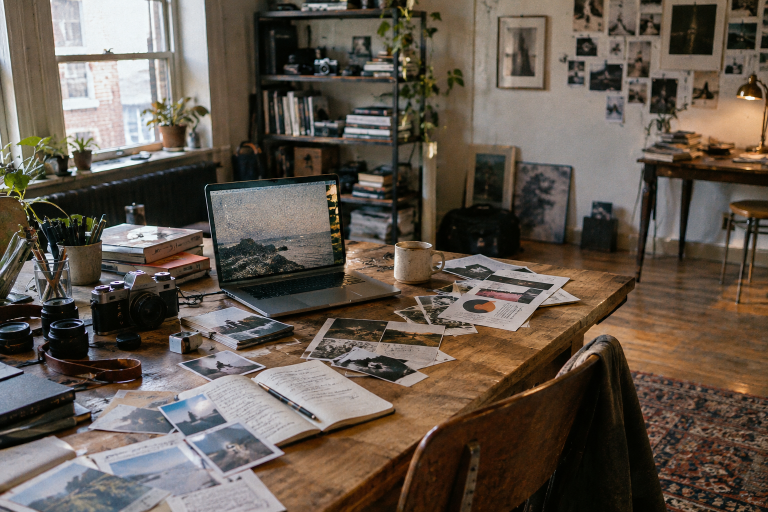
Common Types Of Lo-Fi Visual Treatment

Lo-fi design can take many forms, and each treatment changes the mood in a different way. Start with one or two choices that fit the project instead of layering every possible effect.

  • Film grain: Adds a tactile surface to an otherwise clean photograph.
  • Soft focus: Reduces clinical sharpness and can create a dreamy or distant feeling.
  • Color fading: Can suggest sunlight, age, memory, or repeated handling.
  • Light leaks: Introduce a sense of accidental capture or movement.
  • Uneven cropping: Creates energy and makes a layout feel less formal.
  • Paper texture: Gives digital artwork a physical-looking surface.
  • Low-resolution details: Can reference early web graphics, old cameras, or photocopied print.
  • Handwritten marks: Bring a direct, individual voice to captions and collage work.

Where Lo-Fi Design Works Best

This style is strongest when its mood matches the project. It can suit music artwork, independent fashion campaigns, editorial graphics, personal portfolios, documentary promotions, horror projects, and social posts built around memory or storytelling. It is usually less suitable when a project depends on strict precision or formal authority.

Consider a neighborhood music event poster: one faded photo of the venue, two ink-like colors, and a small handwritten note can make the event feel local and specific. The date, location, ticket details, and call to action should remain clean and easy to find. The texture carries the personality, while the structure carries the message.

A Simple Workflow For Building The Look

  1. Define the mood. Choose a few words, such as nostalgic, eerie, playful, warm, or homemade.
  2. Start with a strong image. Pick a photo with a recognizable subject and useful composition.
  3. Choose one main distortion. Begin with grain, fading, blur, or texture rather than all four.
  4. Limit the palette. A small color range helps the image feel cohesive.
  5. Add one human detail. Try a scribble, rough border, note, or simple collage shape.
  6. Check the message. Confirm that the subject and purpose remain immediately understandable.
  7. Test real sizes. Review the work on a phone, a desktop screen, and a small thumbnail.
  8. Remove one effect. If the result feels busy, simplify before adding anything else.

Mistakes That Make Lo-Fi Design Look Sloppy

Controlled imperfection still needs hierarchy. Common problems include using too many filters, burying text in texture, adding noise without a clear mood, copying a trend that does not fit the subject, and reducing contrast until essential details disappear. Keep the message clean and let the surface carry the roughness. Viewers should sense the mood before they notice the technique.

Keeping Rough Visuals Clear And Accessible

Expressive design should not block communication. Keep essential text away from the busiest parts of an image, use solid panels behind small type when necessary, and do not depend on color alone to communicate key information. Meaningful images also need descriptive alternative text. The Web Content Accessibility Guidelines provide practical criteria for contrast, text alternatives, and content that people can perceive and use.

Common Questions About Lo-Fi Design

Is Lo-Fi Design The Same As Low-Quality Design?

No. Lo-fi design uses selected imperfections on purpose. Low-quality design usually contains uncontrolled problems, such as unreadable text, weak spacing, or images that no longer communicate their subject.

Does It Work For Every Brand?

No. It works best when warmth, nostalgia, experimentation, or an informal point of view supports the brand. A clinical service, legal document, or technical instruction may need a cleaner approach.

How Many Effects Should An Image Use?

There is no fixed number, but one strong treatment often has more impact than several competing ones. Let the audience, platform, and message determine the level of imperfection.

Can A Clean Image Still Feel Human?

Absolutely. Framing, lighting, typography, subject choice, and an honest story can all create human character. Imperfection is a creative option, not a requirement.

Final Takeaway

Imperfect imagery feels human when it looks chosen rather than careless. Use grain, blur, fading, texture, and uneven details to strengthen a story, not to hide a weak one. The best lo-fi design brings a sense of place, touch, and authorship to polished digital spaces while keeping the message clear.

9 Graphic Designer Skills Artistic Entrepreneurs Need

graphic designer skills artistic entrepreneurs

Forging ahead on your career path can fraught with bumps and challenges. This can be especially true for a career involving creativity. 

For some careers, like a teacher, for example, you get out of high school. You go to college. You student teach and look for a full time teaching position. 

Many careers follow a very linear path to get settled in them. Graphic design might not be quite like that.

Graphic designers are often creative souls who start by making some logos and getting experience. They know computers and help out some friends with branding. 

There are great professional opportunities in graphic design with the right set of skills. If you're interested in graphic design and want to pursue a career what skills should you have to land a job in the field?

Read on to learn about graphic designer skills needed for this career. 


1. Photoshop and Adobe Programs

Carpenters have a hammer and wood. Stylists have scissors and combs. 

Photoshop and Adobe Illustrator are the same for graphic designers. Nearly every graphic design job in the field will need you to be well versed and skilled in using these programs.

If you don't feel confident and well-versed in the use of these programs, consider taking a class. 

Spend some time working with them on your own. Learn the ins and outs of the program so you become a fluent user. 


2. Other Print Programs, Microsoft Office

The more diverse your skills are with any available design programs, the more marketable you become. 

Programs like Canva or Snapseed offer various platforms for graphic design. You won't know what programs your potential employer uses. The more you know about a variety of programs the better. It definitely helps to be a Canva pro though.

Also, be well acquainted with the suite of Microsoft Office programs, especially PowerPoint and Publisher. 


3. Typography

This is at the core of what graphic designers do, especially in today's technology-driven world. Typography is the art of letters and fonts. It's taking words and creating them in a visually pleasing way or as an art form. 

Graphic designers need to know the technical elements of typography. This broadens their ability to be hired. 

With so many companies, online and as brick and mortar locations, looking for branding and logos, this is an important skill to promote yourself as a graphic designer. 


4. Coding

Graphic designers do not need to have the same skills as a computer programmer. They don't even need to act as tech support. 

Having said that, as a part of a team involved in website design, having some skills in HTML will be very helpful. As a graphic designer, it is likely that many, if not most, of your client base will have websites.

HTML is the coding used to run web browsers. This is good knowledge to have to support you as a graphics person. 

Additionally, knowing some things about Java or C+++ may not be necessary but again, helpful. 


5. Branding

As a graphic designer, one important thing you will do for your clients is to help them to visually create their brand. Branding helps a business do marketing and gain customers through brand recognition. 

The designer's role is to help create a logo, decide on colors for the brand. They will help to take that logo and those colors and to use it different ways to support the brand. 

The graphic designer can even help to show how printed color versus digital color will play out in branding and marketing campaigns. 


6. Creativity

Many graphic designers end up in this career because they are creative souls who evolved to it. They have a creative brain or a passion for art. They are visual and can imagine a look and carry it out.

Creativity isn't necessarily something you can teach but it's significant for the job. 

Graphic designers have the ability to use that creativity to transform ideas into graphics and brands that help their clients in ways they couldn't imagine. 

All those who describe themselves as "creatives" have slumps or ups and downs with their creativity. It's important to do things to foster and fuel your creativity. 

Watch closely what is happening in the field. Look around you all the time for inspiration.


7. Communication

While this is an ancillary skill, it is nonetheless an important one. As a graphic designer, you will not only have to create for clients but also communicate with them.

The ability to effectively communicate those visual ideas is key to guiding clients through the design process. While a client might not understand how the designer creates graphics, they want you to communicate how it will help them.


8. Goals of Design

Like creativity, this is somewhat intrinsic. As a graphic designer, you need to understand the purpose and goal of creating a graphic design. 

Your role is to visually communicate ideas, messages, campaigns, slogans, etc. Your role is not only to draw things on the computer. 

Understanding the "why" of design is key to successfully creating good design. Know your purpose and role as a designer.


9. Established Design Process

Along with the big overarching goals of design, you have to have a personal process for creating design.

As a graphic designer, you need to know the goal for the design. What objective are you trying to meet for your client?

What steps do you follow in creating the design? What goals do you have to help meet through the process of design?

Understand how you approach the process of design and have a plan for how you get information and achieve success for the client through the design process. 


Graphic Designer Skills to Get You Hired

As a young graphic designer hoping to break into the field, it is smart to be aware of how you can best market yourself. Help yourself by creating a resume and portfolio that highlights these skills for potential employers. 

Having these 9 graphic designer skills will surely put you on the path to success in the field of graphic design. Now it is time to design!

How to Get More Likes on Instagram Photos in 4 Simple Steps

how to get more likes on instagram picture posts

How much are Instagram likes worth these days? In today's social media market, it's worth a lot. If you become an influencer you could form a career from the ground up! 

Growing a following is a difficult task. It can take years to build a following through social media. Is it worth it? 

With the right strategy, it is. It is one of the most rewarding things you can do. 

Are you looking to get more likes on Instagram? In our guide, we'll unpack the tools you need to get you started. 

Ready to jump into the world of IG likes? Let's go get more Instagram likes and followers! 

Start with the Photos 

Long before Instagram became a marketing tool, it was seen as a way to share art. Smartphones these days can make your photos shine. 

To make your photos pop, you may want to upgrade your skills. Even learning simple photo techniques such as the rule of thirds will take your photos to the next level. 

If you aim to get more likes on Instagram, you ought to start with the actual photos. For some inspiration, we recommend seeing what professionals do. Try to mimic them and experiment with your style. 

Hooray for Hashtags 

The proper hashtag can go a long way for you and your post. Whether you are a budding influencer or brand on the rise, pay attention to the hashtags you are using. 

You want to strike the right balance of being too broad or too niche. You don't want to alienate people or shoot yourself in the foot. 

You could even work backward and see what the popular trends are and focus your posts that way. Getting Instagram likes can be a bit of a game. If you play your cards right with hashtags, you'll be headed in the right direction. 

You can even tuck in hashtags in your stories and bio as well. Just be aware that these won't directly get more Instagram likes. It is still wise to do so as it will be your fanbase from the ground up. 

Captivating Captions 

To flesh out those hashtags, you'll want to use captivating captions. While it may sound obvious at first glance, writing good copy is a skill you'll want to master. 

The key is to stay on topic and on-brand. When you know what your brand is you can express yourself more fully. You'll want to experiment here as well. 

When you strike the right balance you'll increase your Instagram photo likes. 

Depending on your brand, you will come to realize the length of your captions. You may find that less is more, or that writing walls of texts are what your followers enjoy. 

Interact with the App 

Like any good social media platform, you'll want to interact with the app. The more you interact with the app, the more engagement you will drive up. 

This is one of the best ways to get more likes on Instagram. It is human nature. When you like someone's photo or leave a comment then they are more inclined to do the same. 

To sell yourself you can even buy Instagram likes from reputable providers! Buying likes on Instagram will make you one of those brands people need to look out for. 

Get More Likes on Instagram Today 

Soon enough you'll get more likes on Instagram. Follow our guide and you'll be well on your way to increased Instagram likes. 

To stay ahead of the curve on Insta, you'll want to follow our blog. From the Social Media and Marketing sections you'll find tech tools and tips to expand your popularity on the 'Gram and other top social media marketing platforms. 

Adopt what you learn and experiment as well on Instagram.com. We can't wait to see what you come up with with your Instagram posts, pics, stories, reels, videos, and more!

Common Photobook Design Mistakes

photobook design mistakes

Designing photobooks can be fun. However, it is a process that requires patience and precision. If you make a mistake, the quality of your photo book may be disappointing. The following are some of the most common photobook design mistakes. 

1. Having Image Stickers Close To The Gutter Area 

Your photo book will be bound by stapling to form a gutter between two pages. Keep this in mind when designing. You should give an allowance of one to two centimeters. Do not have a big part of the sticker spilling over to the other page. You may lose most of the sticker in the binding. Even though you may use type stickers over the gutter, don't do it with actual photos or text. 

2. Not Allowing For Bleed 

If you don't allow for bleed, you may have unwanted slithers of background. If you wish for an image to extend over the whole cover, you must extend it well beyond the dotted bleed line. If you want your photos to go off the edges in your pages, you should have the edges running past the bleed line. 

3. Misalignment Of Images 

If you do not align your images properly, they will look even worse in the printed product. It is okay to play around with different layouts but you should be careful. 

4. Overestimating Text Size 

The size of your text will look different when printed out. Even though it may be normal when you preview, it may be too large when printed. Print out a page to test its appearance before printing out the entire photo book. If you are designing a photo book for the first time, consider using the standard layout. 

5. Poor Format 

Think about your format before designing a photo book. With most of them, a large landscape is great. It gives you enough space to add photos. If your book is large, you will have enough space for all your photos. Do not be afraid of having white space. It makes your pages look fresh and professional. Adding too many photos on a page may make it look too busy. 

Having a great photo book design is not intuitive. It takes a lot of practice and patience. Even if you have good designs, there is always room for improvement. The ability of a photographer to take amazing photos may fail to reflect if the photobook design is wrong. Your design should match your purpose and the effect that you hope to achieve. If you don't feel confident about your ability to design it yourself, consider getting assistance. You may seek inspiration from the work of others. 

Make Your Photobook With Mixbook

Consider working with Mixbook to design your photobooks. There are plenty of themes for you to explore. You can experiment with them until you find one that meets your needs. There is a suitable theme for every life event. We even give you the option to upload your own design elements. Our designs are fully customizable so you get exactly what you want. 

At Mixbook, we believe that photos tell the best stories. We allow you to create your own story from blank books. You can make your photo book as unique as you want. We believe in documenting all important life events with photos. Mixbook.com is convenient and easy to use. The customer service is amazing.

5 Mistakes to Avoid With CEO Headshots

mistakes avoid ceo headshots employee photos

The first-ever photographic headshot was by Robert Cornelius of Philadelphia in 1839. What's more, it was a selfie. While it was a momentous event in the history of photography using a selfie for your headshot is definitely not recommended.

Great CEO headshots can display your power and values as an executive, but make sure you avoid these mistakes when getting yours.


What is a CEO Headshot?

A CEO headshot is a part of your marketing collateral. It's marketing for you and for your business. It's as important to get this right in the same way as getting the corporate logo right.

This is the go-to image of you that you should use for corporate reports, press releases, and other publicity. It needs to be current, impactful and present you in a positive light. 


1. Selfies Won't Cut It 

Selfies are great. Their immediate, fun and easily shared with friends and family. The standard of photography doesn't have to be great and smartphones have super tools for editing and filtering these images.

They are not the right photographs for your CEO headshot. They look amateurish and undermine your credibility and that of your company. Hiring managers regard online CVs featuring selfies as "unprofessional".


2. Don't Use That Nice Holiday Photograph

You might like the photograph your partner took of you on holiday. Perhaps it brings back happy memories. Don't use it for your CEO headshot.

The background won't be suitable. Your dress is not likely to be business wear. The sun-kissed glow doesn't say "corporate leader".

The repurposed holiday snap looks like you're cutting corners. It suggests a casual approach to quality that customers don't appreciate.


3. This is What I Wear to the Office

Turning up to have your photograph taken as if this is just another meeting on your agenda for the day is likely to result in poor photographs. The best photographer cannot hide the fact you need a haircut or that your shirt is not freshly ironed.

Prepare for the photo session. Have a haircut and be well-groomed.

Bring a set of clothes chosen for the photo and change into fresh clothes. Select the clothes that best communicate your corporate image whether that be a business suit, business casual or some other thought-through, public image.


4. Don't Use Just Any Photographer

Take some time selecting the right photographer for you. Look at their work and ask others for their opinion. Not all photographers are the same.

A professional photographer with expertise in corporate headshots will bring out the best in you during the session. Don't rely on an internet search to find the right photographer. Do your research and get the best photographer for you, not the top Google ranked photographer.


5. Don't Use Old Photographs

Photographs age quickly. Don't get stuck in a CEO headshot rut. You should update your headshot regularly so it is always representative of you and your corporate image.

Keep it fresh and relevant. Look out for inconsistencies like logo changes or your own appearance changing.


Your CEO Headshot Here

Your face is your brand. With so much business happening online and on people's desktops it's important that you have a digital image that you can be proud of. Get your CEO headshots right the next time employee photographs are taken.

New Frugal Finance Blog Posts & Articles